


This is a flat plan on my music magazine's front page. It includes the title, Melodies choice, a main picture, and headings of what's inside. It also states that there is a freebie inside. I added this as people like to get something free with a magazine, meaning my magazine may be more successful than if it was without something. I used Mojo as inspiration when designing this as I think that the target audience of my music magazine is similar to Mojo's therefore their front page I think would appeal to my audience. Of course I adapted their layout to suit Melodies Choice's image and my own style and creativity.
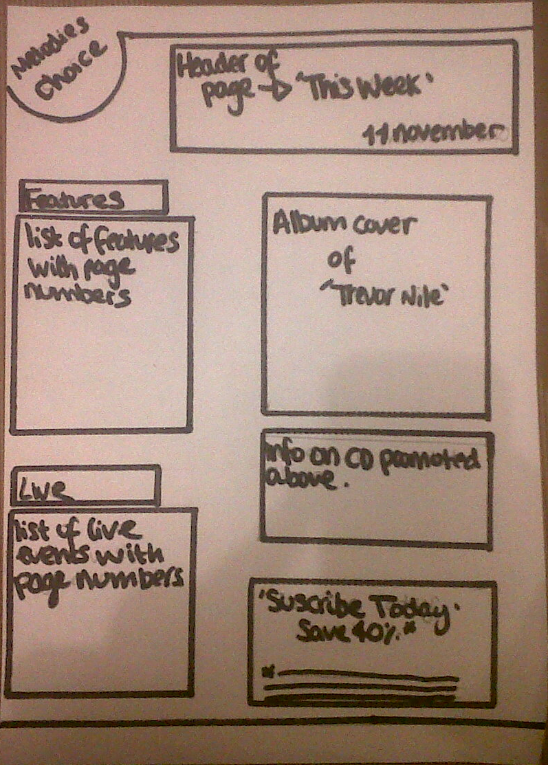
 This is my contents page in flat plan form. For this page I decided to swap around the name of the magazine to the circle in corner, and replace its space with the title of the current page. I did this because it maintains the same type of layout as the front page showing consistency throughout the magazine. I decided to include the title of the magazine on the contents page because I think it emphasizes and therefore promotes itself within its contents. For inspiration on this page I used the design of Q magazine. I chose this one because it is plain and simple and easy to read, whereas the contents page of NME is a more cluttered and this makes it difficult to focus.
No comments:
Post a Comment