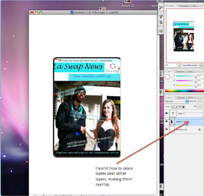
When designing my school magazine, the whole concept of using photoshop was very new. Most things I did were experimental whilst I was figuring out what photoshop was capable of and forming an understanding of how everything operates. This of course was a benefit when designing my music magazine. At the same time I was looking at other magazines and identifying what I liked and didn't like about each of those, and then attempting to use the tools of photoshop to get the results I wanted. Occasionally I would be trying to achieve a desired result when due to my inexperience with the technology I would get a result that I had not intended, but that I liked. An example of this was when it came to choosing my colour scheme. I chose my main burgundy colour and was pleased with this. When I went to chose this colour again, admittedly I was not paying much attention and selected the wrong colour: a lighter red. I found that this contrasted well with the burgundy, therefore decided to use it in my magazine. But mistakes like this are all part of the learning process.


No comments:
Post a Comment